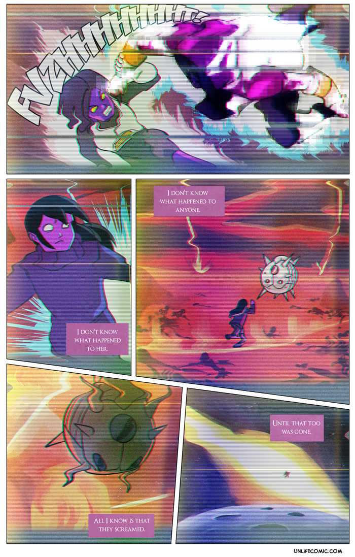
And thus concludes this delightful romp through the world of Dragonball Z(ombie). Believe it or not, this isn’t the first time our artist has found himself in Akira Toriyama’s realm. Everyone should check out Zack’s awesome lettering of the Frieza Saga in volumes two, three, four, and five of the color manga re-release of Dragonball Z!
* Translation:
I want to talk about something I usually avoid: handwriting.
If you haven’t picked up on it already, my handwriting is goddamn atrocious. But I also believe it’s illustrative in a way. It has a unique look to it, a frenetic and wild appearance only slightly resembling the letters and words it’s supposed to represent. As if they’ve been hurriedly pulled over an idea, like a shirt that you throw on and then realize is inside out, backwards or both. I think it’s because of how fast I think as opposed to how fast I can write (as opposed to how fast I can type – which is notably quicker). I am thinking of each sentence and the one that follows, each idea forming and exiting just as quickly, my hand barely able to keep up. Mot of the time when I’m writing, I just have to trust my instincts and hope Future Josh understands what the fuck Past Josh was talking about. It’s like time-travelling, only awful and lame.
I try to relegate my handwriting to notes I can retranslate later or to warm-up writing exercises. Never in my life have I written something by hand and thought, “That looks professional.” In a sense, seeing my handwriting is like seeing me without clothing on. I feel like you are all seeing me for the first time, my writing in its true form, rather than hidden behind the mask of Arial 11. It’s my own textual way of constructing the professional facade that most people get from putting on a suit.
I wanted to do a blog like this, I suppose because of the timing – this interlude on fantasy versus reality. On magnificent and awe-inspiring illusions thrown up against the jarring drudgery of the real world. I’ll probably never do a blog like this again; the fantasy of Arial size 11 is more appealing. Every time I look at my handwriting, I feel like I’m showing off how unrefined and “ugly” I am. It looks ugly to me, at least. And the worst of it is, the words are so hard to even understand sometimes that the intent is lost. The emotional core of what I’m trying to establish is compromised and imperceptible. A pre-prepared font everyone can understand bridges some of that.
I hate my handwriting. I hate it because it’s just so uninterruptedly me. Warts and all. And sometimes I like to pretend that I’m a little more…
Normal, I guess.
 /*
/*


